Building a Scalable SaaS Experience for Seagull Scientific
UX Designer • 2021
Establishing a strong UX foundation for Seagull’s transition from desktop to cloud, empowering users with clarity, efficiency, and compliance.

Background
As Seagull Scientific prepared to evolve its long-standing desktop software into a cloud platform, it faced a familiar challenge: decades of legacy design and fragmented workflows that couldn’t scale for modern use. The transition required more than a visual refresh; it called for a complete rethinking of structure, usability, and user expectations. As the sole UX designer, I focused on building the design foundation from the ground up by introducing user research, responsive layouts, and scalable design patterns that would enable the next generation of the product.

Users previously managed account settings—like permissions, workflows, and integrations—through an outdated desktop app, which was inefficient in fast-paced, dynamic environments.

Designing the organization’s first SaaS product required building processes and design infrastructure from scratch. I led user research, created personas, and built a design system with a reusable UI kit to ensure scalable, consistent product development.

With no prior SaaS UI, the initial low-fidelity concepts were developed with a focus on foundational, responsive navigation and layout patterns, informed by use cases identified through comparative analysis and personas.
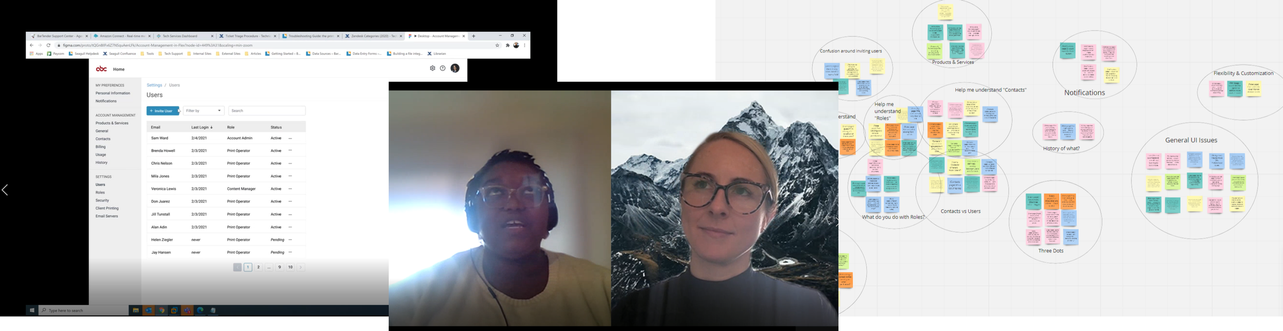
Usability testing of mid-fidelity designs showed high task success rates and strong user satisfaction with ease of use, trust, and loyalty. However, the design wasn’t release-ready, as users struggled with navigation terminology, hierarchy, and cognitive overload on key pages.
goal
To ensure the success of this project, I focused on creating a seamless, efficient experience that allowed users to complete critical tasks quickly and effortlessly while minimizing time spent on management. By implementing clean navigation, logical information architecture, and contextual guidance, I aimed to reduce cognitive friction and align with users’ mental models. Success was measured through both behavioral and attitudinal metrics, targeting a Quality of Experience score of 75 or higher, with a focus on task success rates, time-on-task, and user-reported satisfaction around ease of use, trust, and loyalty.
The final design prioritized clarity and efficiency, providing users with what they needed when they needed it. Simplified navigation, focused content, and clear feedback reduced complexity and made task completion effortless.