Elevating Backup Visibility at Clumio
Lead Product Designer • 2024
Designing Clumio’s backup policy experience to give users visibility and control over critical data protection workflows.
Challenge
As Clumio scaled and focused on shipping new features, the foundational backup policy experience—arguably the most critical part of data protection—was left behind. Years of accumulated tech debt made it hard for users to understand, navigate, and trust their policy settings. My goal as lead designer was to reimagine this experience around clarity and autonomy, helping users manage backups confidently without depending on customer support.

Visitor analytics, user feedback, and past insights revealed 4 key findings:
Low engagement: Most users visited the platform about once a month.
Poor visibility: With no dedicated policy details page, 59% of “edit policy” clicks were just to view information.
Unmet expectations: 83% of users wanted clearer visibility into backup status and failure prevention.
Support dependency: Many relied on customer service for basic policy clarification.

I wireframed early concepts as a wizard to simplify the complex experience and collaborated with our design system lead to develop a fullscreen modal, introducing a new design system component. This approach included a final summary screen with an interactive table, enabling powerful in-line editing while keeping information easily accessible.
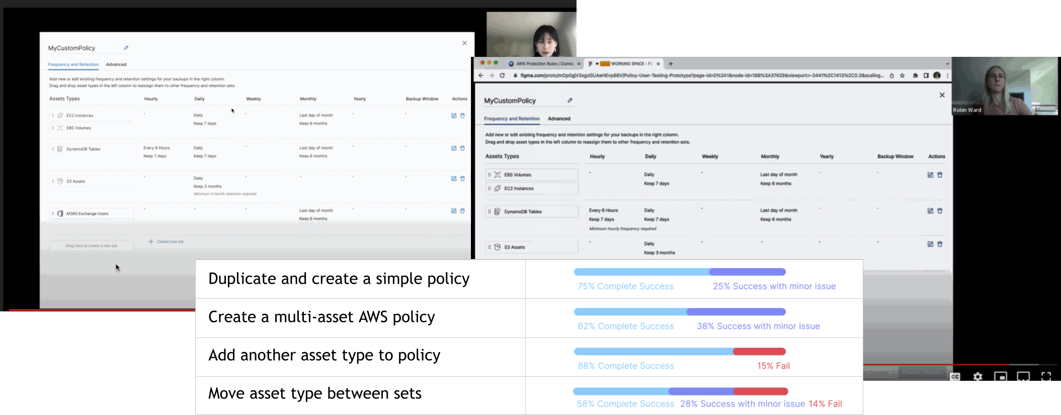
I conducted usability studies on mid-fidelity prototypes, revealing a 70% user satisfaction and task success rate. The findings highlighted the detailed final summary screen as a key feature, with users prioritizing clarity over extensive customization.
Goal
To ensure the project’s success, I focused on designing a transparent, trustworthy experience that empowered users to manage their policies with confidence and autonomy. In close partnership with product and engineering, I guided a research-led redesign that exposed key usability challenges and transformed them into a more visible, trustworthy, and streamlined experience. I collaborated with my systems lead to develop new components that enhanced consistency and scalability across the platform, aligning around a unified, user-centered solution. By centering the experience on an at-a-glance summary and removing the step-by-step flow, I delivered instant clarity and made policy management more seamless and self-sufficient.
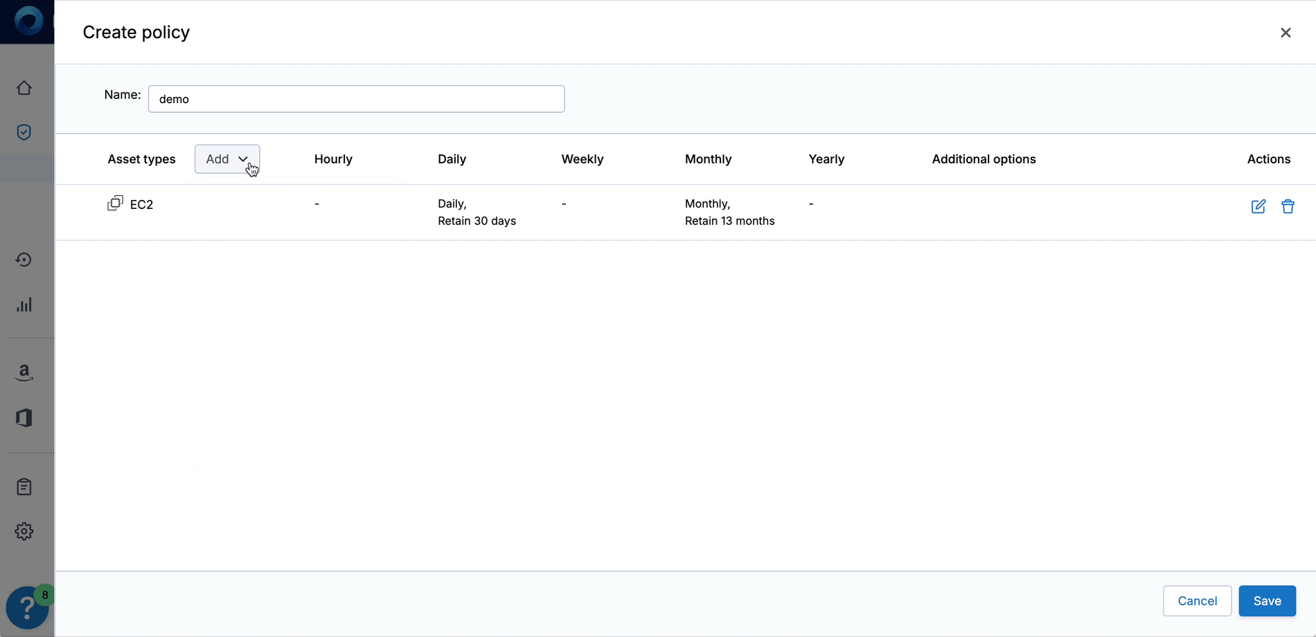
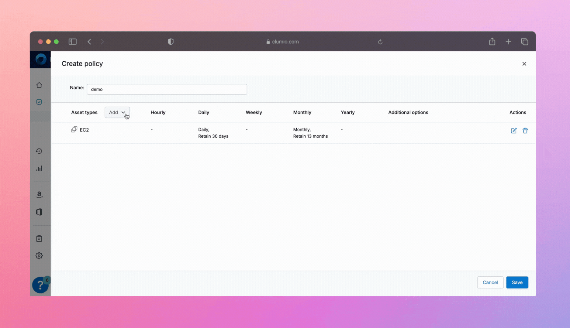
The final design featured a full-screen, at-a-glance policy summary showing the backup schedule across all timeframes. A dropdown let users add asset types step-by-step, simplifying and focusing the process.
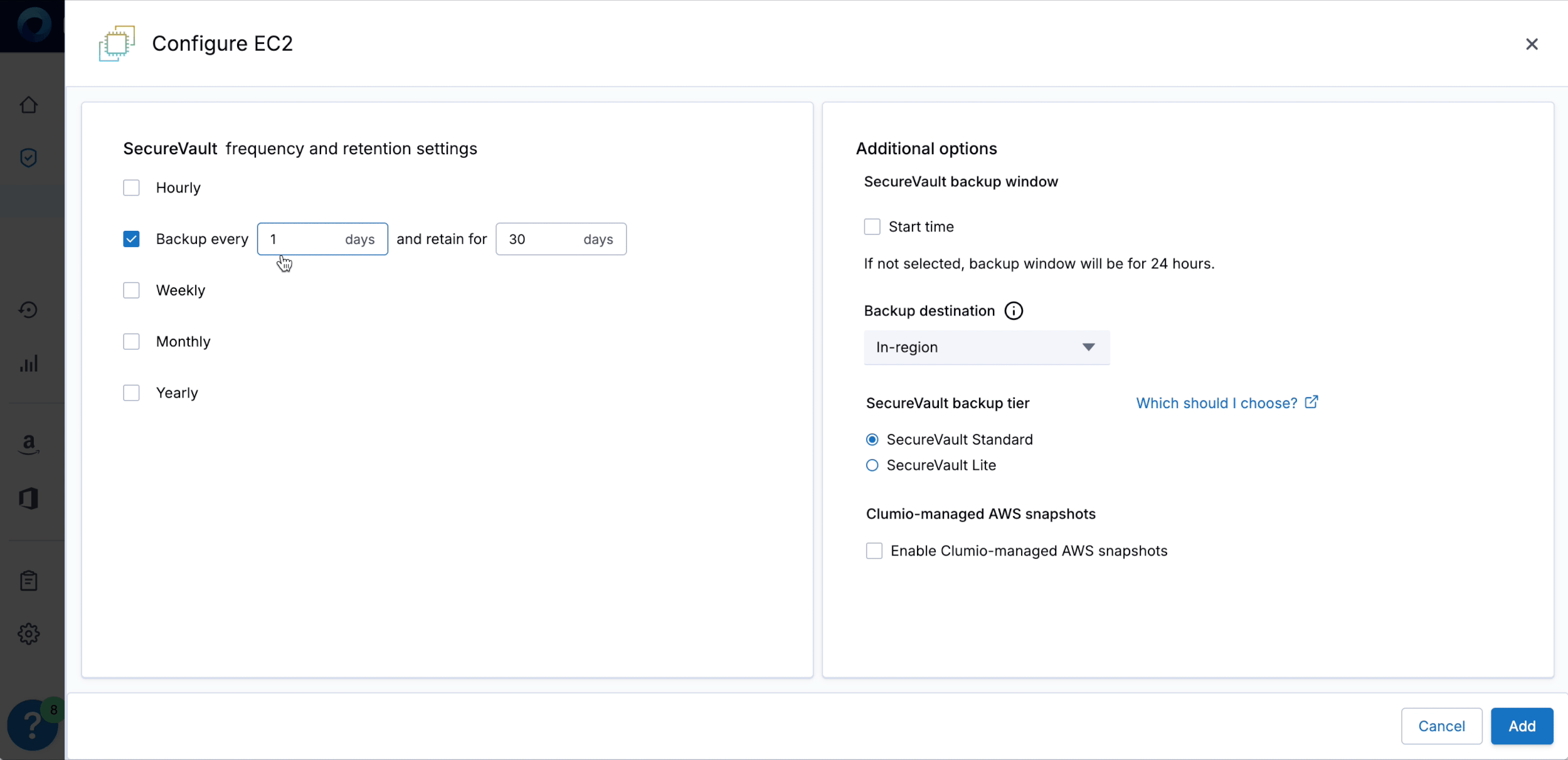
Configuring policies one element at a time was made intuitive. I collaborated with my design system lead to create a new show/hide component within the checkbox hover element, revealing additional information progressively as needed based on the user’s selection.
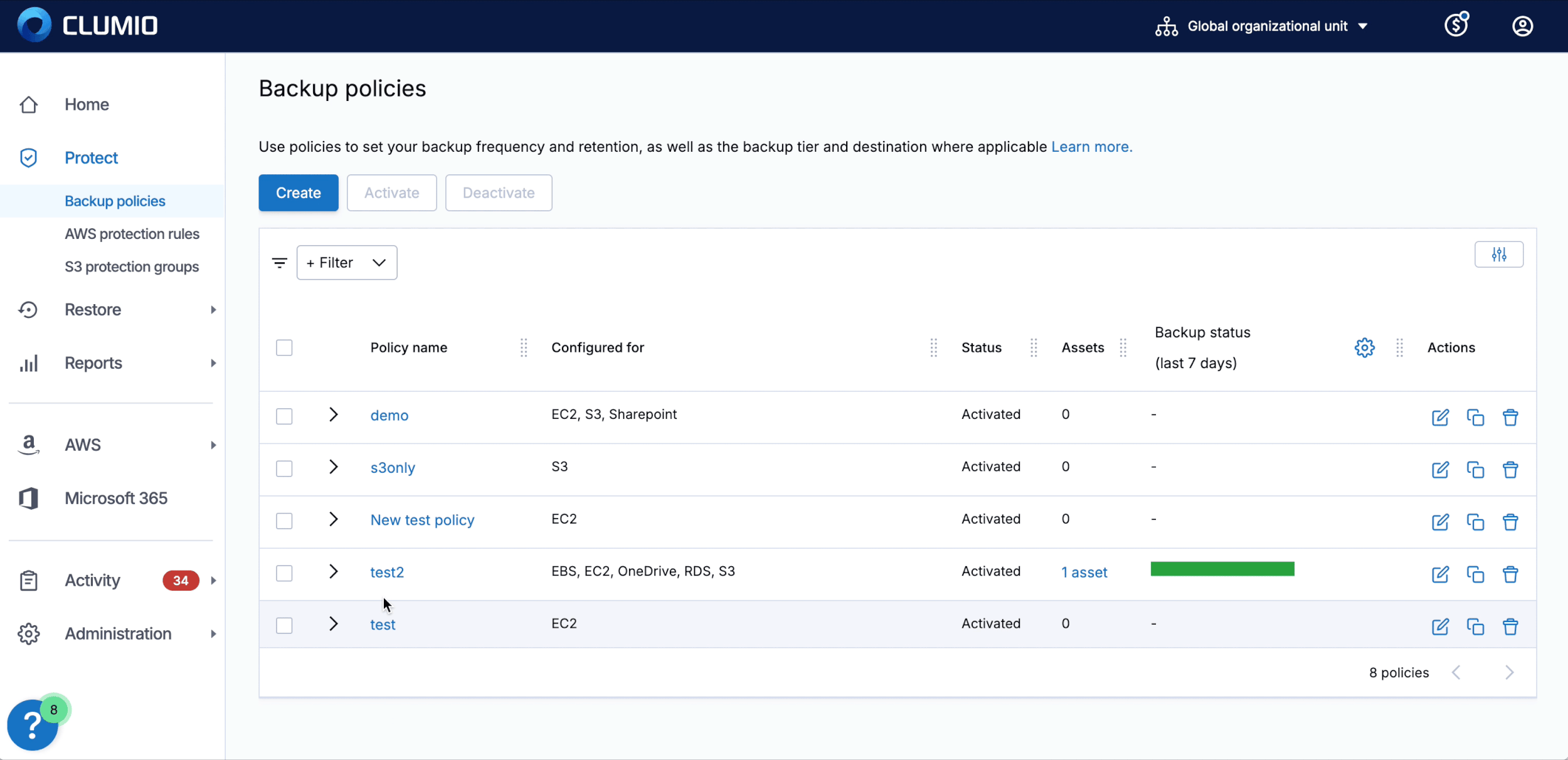
A policy details page, inspired by the summary concept, was added to the Policies section, offering users a clear, centralized view of their configurations. This eliminated the need to click “Edit” just to view details, simplifying the process and making policy management more intuitive.